
Somewhere between 25,000 pieces of calligraphy, I find myself hit by an epiphany that calligraphy is nothing but the traces of the soul. A calligrapher explains why.
Sense of Wander: ★★★★☆
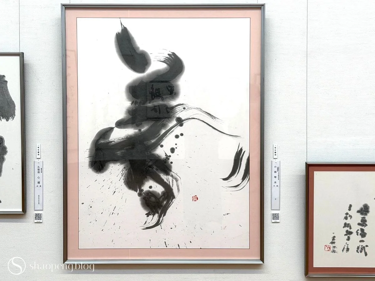
Yume by Kobayashi Kinsui
KYOTO, Japan — I hadn’t planned to spend an entire day standing still, but that’s what happens when you wander into the Mainichi Shodo Exhibition (毎日書道展), said to be the largest exhibition of its kind in Japan.
I arrived knowing very little about what I was about to see. Calligraphy in Japan is known as sho, and those who practise it are called shoka. I had seen examples of how radically free some groups of shoka could be in their approach, but I didn’t understand why or what had brought Japanese calligraphy to that point.
Before we begin, it might help to understand how this exhibition came to exist in the first place, because its story is stranger than you might expect. The exhibition was born in 1948, organised by the Mainichi Newspapers Co. and the Mainichi Shodo Association, at a moment when Japan was still digging itself out of the rubble of the Second World War.
At the time, the government-sponsored Nitten (Japan Fine Arts Exhibition) refused to recognise calligraphy as fine art. To the conservatives running it, shodo was a practical skill of writing, not something to be hung alongside Western oil paintings or Japanese sculpture. Calligraphers fought for years to be taken seriously, and in 1948 they finally succeeded in pressuring Nitten to introduce calligraphy as a “fifth category”. At first, the category welcomed traditionalists and avant-gardists alike, but over the following decade, a string of rejected, too-radical pieces hardened Nitten’s leadership into rigid academic standards, pushing out work that was too modern, expressive, or abstract.
Around that same time, the newspaper stepped in.
It may sound odd at first, until you understand the role newspapers have traditionally played in Japan. Institutions such as Mainichi Shimbun, Asahi Shimbun, and Yomiuri Shimbun have never simply reported the news; they have also acted as cultural patrons, arts institutions, and social stabilisers, treating cultural leadership almost as a form of corporate responsibility.
So Mainichi built its own stage: independent, liberal, and unconstrained by Nitten’s rules. But that harmony didn’t last for long. By 1958, its own avant-garde calligraphers had broken away to form a separate exhibition, unable to coexist comfortably with the traditionalists under the same roof, before eventually merging back into the fold in 1969.
And here I am, nearly eighty years later, wandering through the legacy of that history and, remarkably, it is still very much alive.
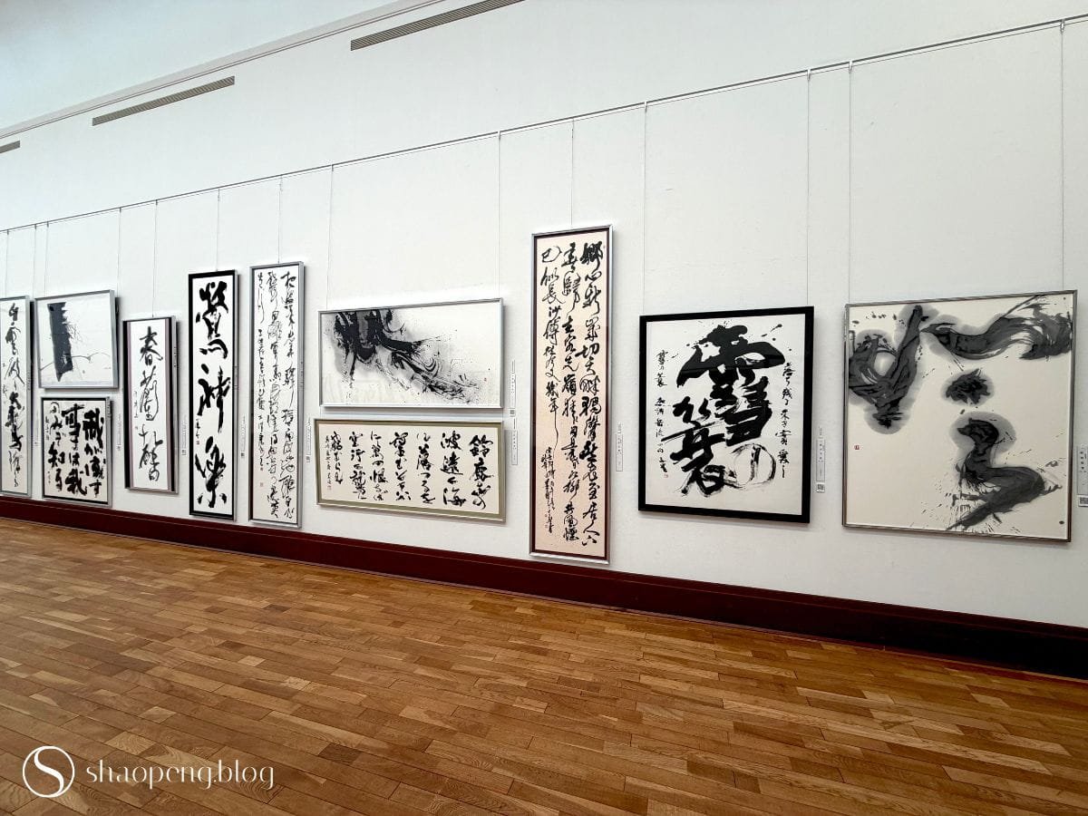
Higher-tier calligraphy works on display in the main hall of the 77th Mainichi Shodo Exhibition in Kyoto.
This year marks the 77th edition of the exhibition, and it is, quite literally, an ocean. With more than 25,000 entries (around 15,000 of them higher-tier works by prize winners, association members, executives, and judges), you could spend an entire day here and still never reach the shore.
Here, seven categories bring together centuries of tradition and the radical experiments of the postwar decades:
Kanji — Traditional Chinese characters
Kana — Japanese phonetic script
Kindai Shibunsho — Modern poetic calligraphy
Daijisho — Large character calligraphy
Tenkoku — Seal engraving
Kokuji — Wood carving
Zeneisho — Avant-garde calligraphy
If you’re wondering why Chinese characters appear in Japanese calligraphy, the answer lies in the history of Japanese writing itself. Chinese characters were introduced to Japan sometime between the 4th and 5th centuries. A few centuries later, the Japanese developed their own phonetic scripts from these borrowed characters, collectively known as kana. Today, written Japanese weaves kanji and kana together in almost every sentence.
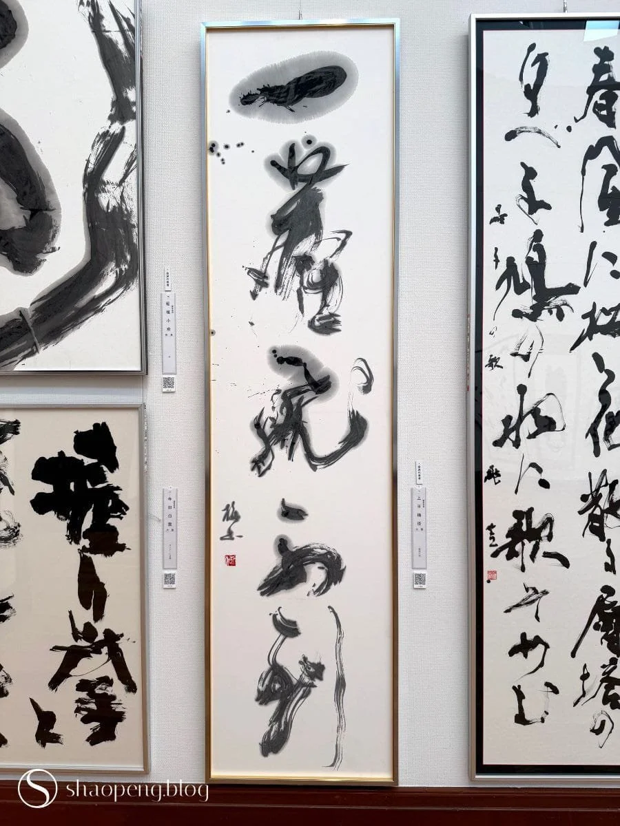
Ichijin tobite todokazu by Uehira Baikei
Somewhere in the main exhibition hall, I find myself standing in front of a piece by Uehira Baikei (上平 梅径), unable to move on.
The work bears the phrase “Ichijin tobite todokazu”(一塵飛不到) written from top to bottom in free-spirited brushstrokes. It translates roughly as “not even a single speck of dust can fly in.” It comes from classical Chinese poetry and Zen literature, describing a place or a state of mind so immaculate that nothing worldly can touch it.
Though it takes me some time to decipher the characters, there’s something about the movement of the ink that gets under my skin. Then all of a sudden an epiphany hit me: calligraphy is, in essence, traces of the soul. To this, Uehira simply responds: “The soul moves; the brush follows.”
This year, the exhibition’s highest honour — the Minister of Education, Culture, Sports, Science and Technology Award — went to a kanji piece by Shuko Yanagisawa (柳澤 朱篁), titled Gashin hiseki fuka tenya (我心匪石 不可轉也). Critics described her lines as robust, magnanimous, and full of vigour. Standing in front of it, I feel a density in the ink strokes that seems almost geological, as though the characters had not been written by hand, but somehow emerged from it.
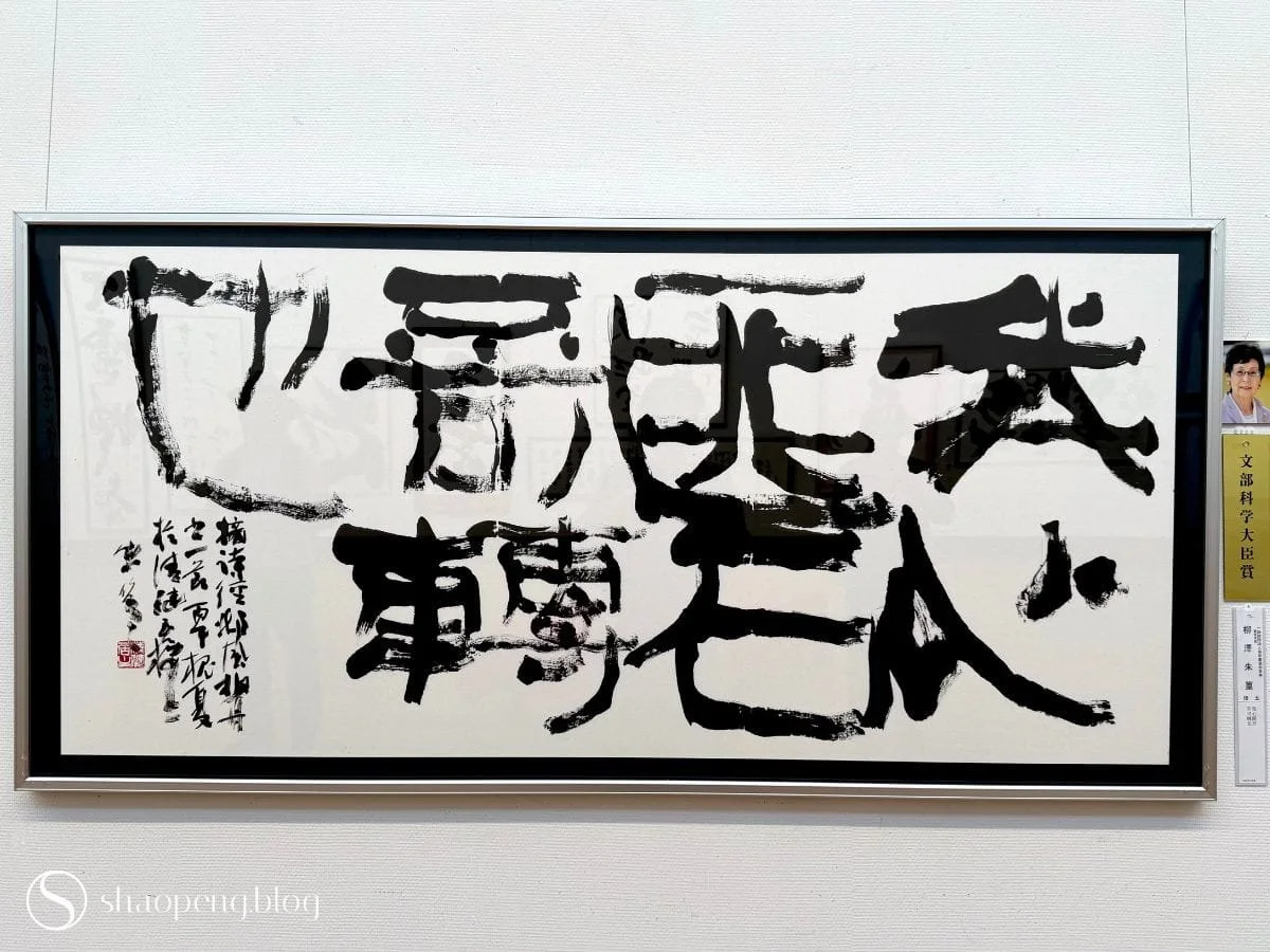
Gashin hiseki fuka tenya by Shuko Yanagisawa
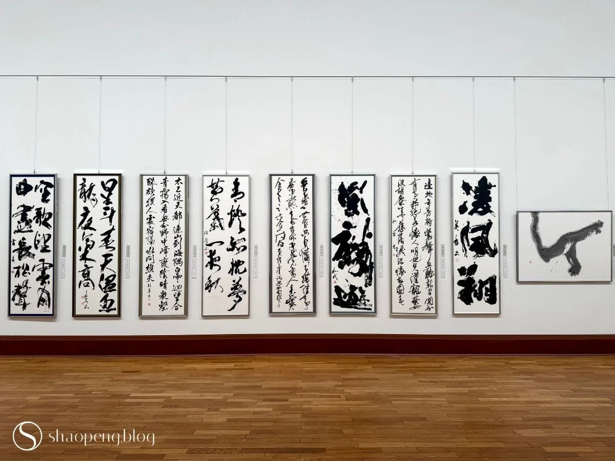
Inside the 77th Mainichi Shodo Exhibition in Kyoto.
Among the exhibits are works from the Daijisho category, where one or two oversized characters dominate the composition.
I find myself standing still in front of Yume by Kobayashi Kinsui, unable to move my feet. The character, meaning “dream,” is rendered with such a free-flowing spirit that it evokes the image of a dancing ballerina caught on paper.
Daijisho, founded by Japanese calligrapher Teshima Yukei (手島 右卿), strips away the long passages and texts often seen in traditional calligraphy, bringing the focus to just one or two kanji characters. The character becomes less a written word than a graphic centrepiece, where the density of the ink, the speed of the brush, and the composition come together to create a powerful presence. It also plays with yohaku, or the “remaining white” of the untouched paper, allowing emptiness to do as much work as the ink.
Right across the room is another daijisho piece by Kataoka Shigekazu (片岡 重和), who renders the kanji for “compassion” in a highly stylised form. When I set my eyes on it, I can’t help but see a standing bok choy. Somehow, it gives this universal and weighty theme a little wink of whimsy.
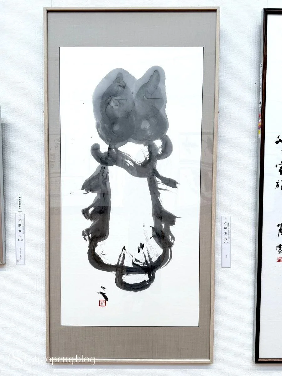
Jihi by Kataoka Shigekazu
Then I come across zeneisho, the avant-garde calligraphy where the rules I had only just started to grasp fall apart.
Here, characters are liberated from both word and meaning. Some call it “ink painting,” others “abstract calligraphy” or “imaginative calligraphy.” Either way, the focus shifts from writing to composition and emotion — to lines that may not correspond to any recognisable character at all.
Ei no zankyo (永の残響) by Tanigawa Yukari (谷川 由佳理) is a good example. Ink storms across the paper as if in a rage, remaining almost undecipherable without the title as a key. What fascinates me is that the character buried within it, 永 (meaning “eternity”), is considered the single most important training character in Chinese and Japanese calligraphy; its eight brushstrokes form the foundation that every calligrapher learns first. Tanigawa took that foundation and set it free.
Instead of writing, zeneisho artists build a purely visual “image of ink” (boku-jin), chasing texture, splatter, and structure, resulting in a raw negotiation between ink and paper. The style peaked in the 1950s and 1960s, in the wake of calligraphy’s admission into Nitten, when traditionalists and avant-gardists went to war over what calligraphy even was. The traditionalists held the line: anything that loses its structural framework, they argued, can no longer be called calligraphy. The avant-garde shot back that outdated, formulaic calligraphy belonged to the past.
Wandering between the two camps, as their works sit side by side from one room to another, I feel as though I’m watching a historic rivalry that is still very much alive.
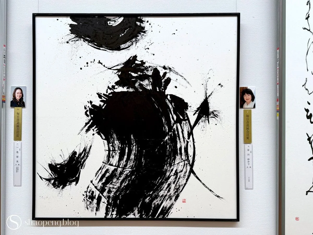
Ei no zankyo by Tanigawa Yukari
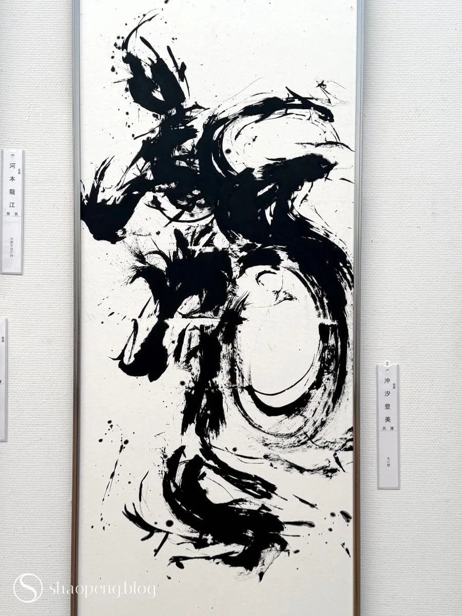
Mizu no koe by Okishio Toyomi
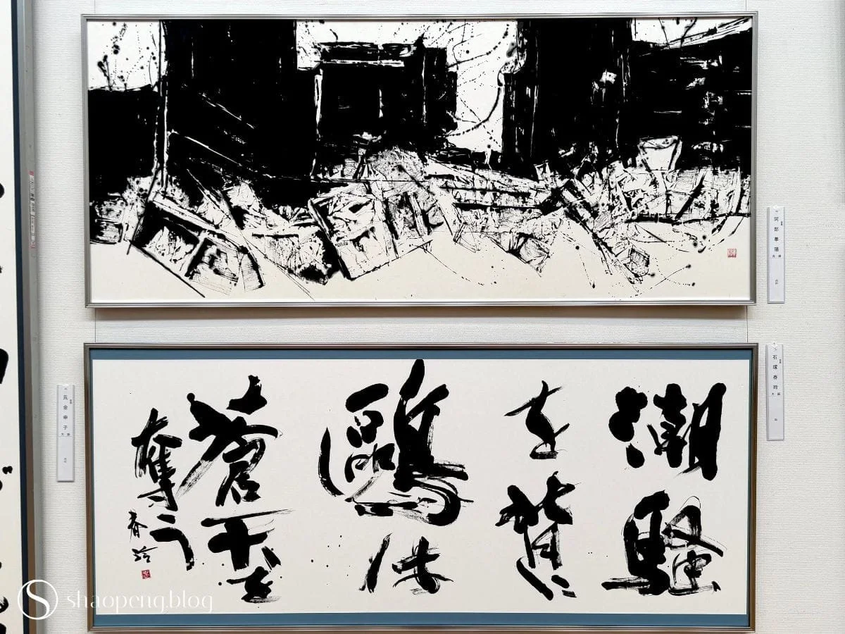
Works from different categories are often displayed side by side.
I must admit that I can’t read kana. But I find myself drawn to it by the coloured paper on which some of it is written. Kana-ryoshi is the traditional art of dyeing and decorating fine paper specifically for cursive kana calligraphy.
Kana began as an intimate, almost secretive script, used mostly by women in personal letters and poetry scrolls. Written onto ryoshi, the ink and the paper seem to have a private conversation — one I couldn’t fully translate, but could still feel.
The 20th-century Grand Kana Movement took that whisper and blew it up into something monumental and public, and the paper evolved alongside it.
Not every kana piece here uses this special paper, but the ones that do carry a mood you can sense even without being able to read the script; it’s a pull that, I imagine, only deepens when you can actually read the words.
I’m so mesmerised by the beauty of the paper that I find myself hunting through local paper shops for sheets of dyed ryoshi — at considerable cost — for works of my own that I hope to start soon.
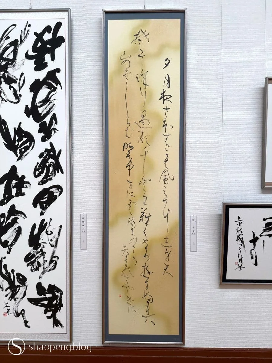
Some kana works are written on beautifully coloured ryoshi.
For a calligraphy practitioner like myself, wandering through the Mainichi Shodo Exhibition seems to have unlocked something within me. The avant-garde pieces, especially, keep nudging me to reconsider what I thought calligraphy — both Chinese and Arabic — is allowed to be. And somehow, that avant-garde energy seems to have travelled through my hands and into my own daily practice.
It’s worth noting that Mainichi sits alongside Nitten, the Yomiuri Shodo Exhibition, and the Sankei International Exhibition of Calligraphy as one of Japan’s four major calligraphy exhibitions. Of these, Yomiuri — where the emphasis leans more toward classic calligraphy — has become a rival camp to Mainichi since 1984, when a wave of senior Mainichi artists broke away over differences in style and philosophy.
While some people may prefer one over another, it’s important to remember that it is precisely because these contrasting ideologies and aesthetics keep pushing against each other that the world of calligraphy remains as alive and vibrant as it is, especially in a digital age when most of us have almost forgotten what it feels like to put pen, or brush, to paper.
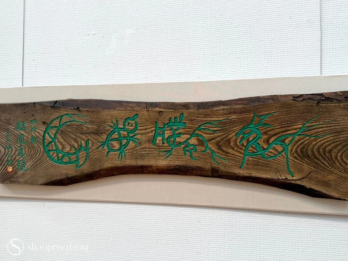
Wood carving, Rinpo Kiryu, by Jono Soshin.
Reference:
お字書き道TALKS. (2026). 西洋とも闘った日本の熱き書道家8人-#170 [Video]. YouTube. https://www.youtube.com/watch?v=HfpSaFpyeZM